Executive Summary
Political power at the federal level depends on representation of state delegates to the House of Representatives. How district boundaries are drawn plays a huge role in the political makeup of that power. This project examines Pennsylvania congressional redistricting after the 2020 Census, when reapportionment removed one seat from the commonwealth’s caucus. Instead of eighteen seats, the Pennsylvania was required to redraw their map to cover the same area with one fewer congressional district. This study asks two main research questions. First, how strongly do socioeconomic and geographic clustering impact voter behavior in Pennsylvania. Second, I look at how that translates into seat outcomes across an ensemble of simulated seventeen-district maps.
Previous redistricting research provides many tools for evaluating maps, including efficiency gap, mean-median difference, partisan bias, compactness , and simulation-based comparisons. However, most of this research focuses on assessing fairness of particular existing or proposed maps. This project focuses on how Pennsylvania’s underlying political geography impacts the reapportionment problem by simulating outcomes of the 2020 election cycle with one fewer district. I combine 2020 block and tract level Census data with voting tabulation districts (VTDs) as well as the 2020 election results to explore the existing special component of voting behavior.
I also compare socioeconomic and demographic data to develop a multilinear regression model. Using tract level variables such as education, income, poverty, occupation, age and race, the model predicts the Democratic two-party vote share with an Adjusted R-Squared value of 0.79. Separate geographic clustering analysis shows that a VTD’s Democratic vote share is highly correlated with neighboring VTD’s average voting patterns, explaining about 86% of the two-party vote share variation.
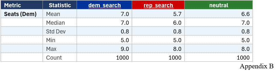
The simulation results showed that neutral seventeen-district maps tended to favor Republicans. Across 1,000 neutral simulations, Democrats averaged 6.55 seats and never won more than 8 of 17 seats. Democratic-favorable searches were able to produce some 9-seat Democratic maps, showing that such outcomes are possible, but they did not appear naturally in the neutral simulation. Overall, the project suggests that Pennsylvania’s redistricting outcomes are shaped by both map design and the underlying geography of voter preference. For decision makers, the main implication is that redistricting fairness should not be judged by one metric or one map alone. A more useful approach combines demographic analysis, geographic clustering, multiple fairness metrics, and simulation-based comparisons to understand the range of likely outcomes.
Presentation
Slides
Paper
Introduction
Redistricting plays a major role in shaping election outcomes in the United States. Typically, after each Census, states are required to redraw their congressional districts to reflect population changes (though some states are choosing to redraw their districts purely for political gain over the past year). Sometimes this process results in small adjustments, but other times it leads to more significant changes. One of those cases occurred in Pennsylvania after the 2020 Census, when the state lost a congressional seat and went from eighteen districts to seventeen.
At a basic level, this means the same population has to be divided into fewer districts. Where the boundaries are drawn can influence which voters are grouped together, and ultimately, which party is more likely to win each district. Voting behavior is not randomly distributed. People who live near each other often vote similarly, which means that geographic patterns play a large role in election results.
By combining spatial analysis, simulation, and standard fairness metrics, I hope to better understand how changes in district structure. Pennsylvania provides a useful case for this type of analysis because the population and voting data remain the same, while the number of districts changes, making it possible to isolate the effect of redistricting itself.
This study also examines why Pennsylvania voting patterns are geographically clustered in the first place. Using census-tract socioeconomic and demographic data from the American Community Survey, the project estimates whether variables such as education, income, poverty, occupation, age, and race/ethnicity predict Democratic two-party vote share. This regression model provides context for the simulation analysis by showing that district outcomes are not only shaped by boundary decisions, but also by the underlying geography of voter preference.
Research Questions
RQ1: How strongly do demographic characteristics predict Democratic two-party vote share in Pennsylvania?
RQ2: How do Pennsylvania’s geographically clustered voting patterns translate into seat outcomes across simulated seventeen-district congressional maps?
Literature Review
There is a large amount of research on redistricting. However, most of it focuses on whether a specific map is fair, rather than what happens when the number of districts itself changes. In Pennsylvania, the number of congressional districts dropped from eighteen to seventeen after the 2020 Census. That creates a situation where the same population has to be reorganized into fewer districts, which may change election outcomes even if voter preferences stay the same.
Measuring Fairness in Redistricting
A lot of redistricting research focuses on measuring fairness using summary statistics. One of the most common is the efficiency gap, which looks at “wasted votes.” These include votes for losing candidates and extra votes for winning candidates beyond what they needed to win. The idea is to measure how efficiently each party converts votes into seats (Stephanopoulos & McGhee, 2015; McGhee, 2014).
Other researchers argue that no single metric is enough. Instead, they recommend using multiple measures, like the mean–median difference or partisan bias, because each one captures something slightly different (Wang, 2016). There is also a lot of discussion about trade-offs. For example, you might want districts to be compact, equal in population, fair between parties, and fair to minority groups, but it is often not possible to optimize all of these at the same time (Schutzman, 2020; Belotti et al., 2025).
The main takeaway from this area of research is that fairness is not a single number. It is something that has to be evaluated across multiple dimensions and usually in comparison to other possible maps (Bernstein & Walch, 2022; Skowran, 2020).
Political Geography and Voter Clustering
Another important area of research looks at where voters live and how that affects elections. If voters were randomly spread out, then district boundaries would not matter very much. But in reality, voters are clustered geographically.
For example, Democratic voters tend to be more concentrated in cities, while Republican voters are more spread out in rural areas. This means that even a neutral map can sometimes favor one party over the other, simply because of how people are distributed (Chen & Rodden, 2013).
This idea is closely related to spatial analysis tools like Moran’s I, which measures how similar nearby areas are. In this project, a very high Moran’s I value shows that voting behavior in Pennsylvania is strongly clustered. This supports the idea that geography plays a major role in determining election outcomes.
The key point here is that clustering is what makes redistricting important. Because voters are grouped together geographically, changing district boundaries changes how those groups are combined, which can change the results of elections.
Socioeconomic Factors in Voting Behaviors
In addition to spatial clustering itself, voting patterns are often associated with socioeconomic and demographic characteristics. Cantoni and Pons (2022) examine how both individual characteristics and geographic context shape voting behavior in the United States, supporting the idea that voting patterns are connected not only to where people live, but also to measurable characteristics of the people and communities living there. At the census-tract level, variables such as educational attainment, income, poverty, race and ethnicity, age, and occupation can therefore be used to test whether Pennsylvania’s observed political geography is connected to measurable socioeconomic conditions.
Simulation and Ensemble Methods
More recent research has moved away from looking at a single map and instead focuses on comparing many possible maps. The idea is that one map by itself does not tell you much. Instead, you generate a large number of possible maps that follow the same rules and then see how outcomes vary across them (Fifield et al., 2020; DeFord et al., 2020).
This is usually done using simulation methods, which create many different district maps by slightly changing boundaries each time. These maps are then evaluated using fairness metrics. If one map looks very different from most of the others, it may be considered biased (Burden & Smidt, 2020).
The main takeaway from this area is that redistricting should be understood as a range of possible outcomes, not a single fixed result.
Pennsylvania-Specific Research
Pennsylvania has been studied quite a bit in redistricting research, especially because of the legal case that struck down its 2011 congressional map. That case used simulation-based analysis to show that the map was an outlier compared to other possible maps (Russell & Lieberman, 2023).
There is also research that highlights how difficult Pennsylvania data can be to work with. Voting districts (VTDs) do not always match up cleanly with Census boundaries, which creates challenges when combining population and voting data. This matches the data preparation issues encountered in this project (Russell & Lieberman, 2023).
Most of the work focused on Pennsylvania looks at whether specific maps are fair or biased. However, there is less research on how the reduction from eighteen to seventeen districts changes the underlying behavior of the system.
Research Gap
Previous research gives us a lot of useful tools for studying redistricting. Fairness metrics like the efficiency gap, mean-median difference, partisan bias, compactness, and simulation-based map ensembles all help measure how votes get translated into seats. Other research also shows that geography matters because voters are not randomly spread out. In Pennsylvania, Democratic voters are often more concentrated in cities and dense suburbs, while Republican voters are more spread out across rural and smaller-town areas. That means a map can create a partisan advantage even if the lines are not obviously strange or intentionally biased.
The gap this project focuses on is how those two ideas work together when Pennsylvania loses a congressional seat. Most research looks at whether one specific map is fair, but this project asks what happens when the same population and voting patterns have to be reorganized from eighteen districts into seventeen. To study that, I use census-tract regression analysis to look at which socioeconomic and demographic factors predict Democratic vote share, and then use simulated district maps to see how those geographically clustered voters turn into seat outcomes. In other words, the goal is not just to ask whether one map is fair, but to understand how sensitive Pennsylvania’s election outcomes are to the way voters are grouped into districts.
Methods
This project uses population data, geographic boundary files, election results, and Census socioeconomic data to study Pennsylvania redistricting after the state went from eighteen congressional districts to seventeen. The main goal is not to prove that one specific map is fair or unfair. Instead, I wanted to see how Pennsylvania’s existing voting patterns behave when they are reorganized into different possible district maps.
The main data sources were 2020 Census block-level population data, Census TIGER/Line shapefiles, Pennsylvania Department of State 2020 election results, Voting Tabulation District boundaries, and 2020 American Community Survey 5-Year Data Profile tables. One of the biggest challenges was that these datasets do not fit together perfectly. Census blocks are the smallest Census geography, but election results are reported by VTDs, which are closer to precincts. Since those boundaries do not always line up cleanly, some transformation was needed.
To deal with this, I used QGIS to assign Census blocks to VTDs using a point-on-surface method. Then I estimated Democratic and Republican votes at the block level by distributing VTD vote totals based on population. This is not perfect, as it will assign some nominal population to incorrect census blocks where the block and VTD do not overlap, but it creates a workable dataset that connects population, geography, and voting behavior.
For the simulation part, I used Python and a widely used library published by called GerryChain to generate possible seventeen-district maps. GerryChain was developed by the Metric Geometry and Gerrymandering Group, a nonpartisan research organization associated with the University of Chicago. Each map was scored using fairness and district-quality metrics.
Metric Definitions:
· Efficiency Gap - measures the difference between the two parties’ wasted votes, where wasted votes include losing votes and surplus winning votes.
· Mean-Median - compares a party’s average vote share across districts to its vote share in the median district.
· Seat-Vote Gap - compares a party’s share of seats won to its statewide share of the two-party vote.
· Partisan Bias at 50% - estimates how many seats each party would be expected to win if the statewide vote were evenly split.
· Seats (Dem) - counts the number of simulated districts where the Democratic vote share is greater than the Republican vote share.
· Seats (Rep) - counts the number of simulated districts where the Republican vote share is greater than the Democratic vote share.
· Competitive Districts - counts the number of districts where the vote margin falls within 10%.
· Compactness - the average geometric compactness of the districts in a simulated map. Higher scores indicate less weird looking shapes.
· Population Deviation Range - Population deviation range measures the percentage difference between the most-populated and least-populated districts in a simulated map.
The Python workflow was developed with help from AI coding agents in Cursor. My full repository of code is available on GitHub. I used the AI tools to help write, debug, and revise scripts for data processing, map simulation, and metric calculation. I reviewed the code, made changes where needed, and interpreted the results myself. The fairness metrics were sourced from the sources identified in the literature review and were implemented by the AI agent.
I also built a regression model using ACS tract-level data from DP02, DP03, and DP05. The dependent variable was Democratic two-party vote share, and the predictors included things like education, income, poverty, unemployment, occupation, age, race, and ethnicity. This helped test whether Pennsylvania’s voting patterns are connected to measurable socioeconomic and demographic factors.
AI-Assisted Qualitative Analysis
This project also incorporates qualitative work from an earlier assignment on human-AI collaboration and redistricting fairness (Appendix D). In that analysis, I used a structured four-stage LLM-assisted thematic analysis workflow to examine redistricting case law. The process began with League of Women Voters v. Commonwealth as a foundational case, then identified cited cases, extracted relevant excerpts from court opinions, used open coding to identify recurring ideas, clustered those codes into broader themes, and synthesized the results into a thematic framework. The workflow used multiple AI tools, including ChatGPT and Claude, with human review and interpretation at each stage.
The qualitative analysis found that courts generally define fairness through constitutional principles, equal voter participation, neutral redistricting criteria, and protection against vote dilution. It also found that courts are cautious about using quantitative metrics as determinative standards, instead treating them as supporting evidence. These findings informed the design of the current study by reinforcing the need to use several fairness metrics and simulation outcomes rather than relying on a single numerical definition of fairness.
Data Description
This project uses several different data sources that had to be combined into one working dataset. The main sources were 2020 Census population data, Census TIGER/Line geographic boundary files, Pennsylvania 2020 election results, Voting Tabulation District boundaries, and ACS 2020 5-Year Data Profile tables. The election and geography data were used for the map simulations, while the ACS data was used for the regression model.
The smallest geographic unit in the project is the Census block. Pennsylvania has over 300,000 blocks, but not all of them have people living in them. In my dataset, the median block population was about 20 people, the mean was about 38 people, and around 18% of blocks had zero population. This is important because people are very unevenly spread out across the state.
One issue is that Census blocks and VTDs do not perfectly line up. Election results are reported by VTD, but population data is available by Census block. To connect them, I assigned blocks to VTDs and then estimated Democratic and Republican votes at the block level based on each block’s share of the VTD population. This means the voting data is not perfect at the block level, but it gives a reasonable way to connect votes, population, and geography.
For the regression model, the voting data was aggregated to the census tract level and joined with ACS variables from DP02, DP03, and DP05. These included education, income, poverty, unemployment, occupation, age, race, and ethnicity. The final tract-level dataset was used to test whether socioeconomic and demographic factors help explain Democratic two-party vote share in Pennsylvania.
Results
RQ1 - How strongly do socioeconomic and demographic characteristics predict Democratic two-party vote share across Pennsylvania census tracts?
A multilinear regression model was run on nine independent variables:
Variable
median_household_income
pct_poverty
unemployed_rate
pct_professional_occupation
pct_production_transportation
pct_bachelors_or_higher
pct_some_college_no_degree
median_age
pct_nonhispanic_white
pct_nonhispanic_black
pct_hispanic
These variables were selected because they represent a variety demographic characteristics that may help explain voting patterns. They include measures of income, poverty, employment, occupation, education, age, race, and ethnicity.
One limitation of this model is that some of the variables are probably related to each other. For example, bachelor’s degree attainment, income, and professional occupation share may overlap. The goal of the model is not to prove that any single variable causes voting behavior, but to test whether tract-level socioeconomic and demographic characteristics are useful predictors of Democratic vote share.
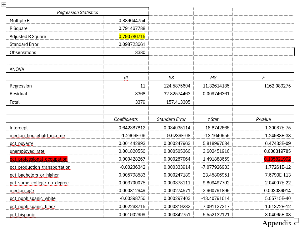
The overall model was strong. The regression analysis shows an R-squared value of 0.79, meaning that the selected variables explained about 79% of the variation in Democratic two-party vote share across Pennsylvania census tracts. Additionally, ten of the eleven tested variables are statistically significant at the p <= 0.05 level. This suggests that voting behavior in Pennsylvania is strongly connected to measurable geographic, socioeconomic, and demographic patterns.
Median household income, while having a statistically significant p-value, has an extremely low coefficient (-1.2669 x 10 ^ -6). This is because it is measured in dollars, so a single dollar increase in median income doesn’t have much impact, but it would translate to about 1.27% decreased democratic voter share per $10,000 in increased income. Other impactful variables are college degrees, percent in poverty, and percentage black voters.
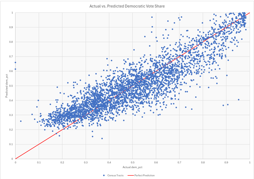
I then used this model to find the predicted dem_vote in each census tract. The Actual vs Predicted Democratic Vote Share shows that the model did a good job overall. It sometimes overpredicted Democratic vote share in very Republican areas and underpredicted Democratic vote share in very Democratic areas. Towards the bottom left of the chart, where actual dem_pct is low, the model tends to over-estimate Predicted dem_pct (seen as being over the line).
Finally, I also measured the geographic clustering of voting behavior itself. Instead of looking directly at socioeconomic variables, this analysis looked at whether neighboring census tracts tended to vote similarly (a purely geographic analysis). To do this, I used QGIS to create an adjacency table showing which census tracts bordered one another. I then calculated the average dem_pct of each tract’s neighboring tracts and used Cursor to help run a simple linear regression testing how well neighboring vote share predicted a tract’s own Democratic vote share.
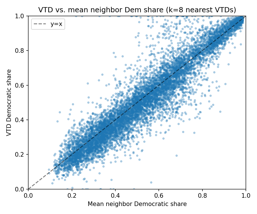
The model produced an R-squared value of 0.86, which suggests that voting patterns in Pennsylvania are highly geographically clustered. This makes intuitive sense because socioeconomic and demographic patterns are also often clustered across urban, suburban, and rural areas, and even within different neighborhoods of the same city.
RQ 2 - To what extent does geographic clustering of voting behavior explain differences in outcomes across simulated district maps?
The redistricting simulation results also showed a clear pattern. In the original neutral 1,000-map simulation, Democrats won between 5 and 8 seats out of 17. The most common outcomes were 6 or 7 Democratic seats, and no neutral map produced 9 Democratic seats.
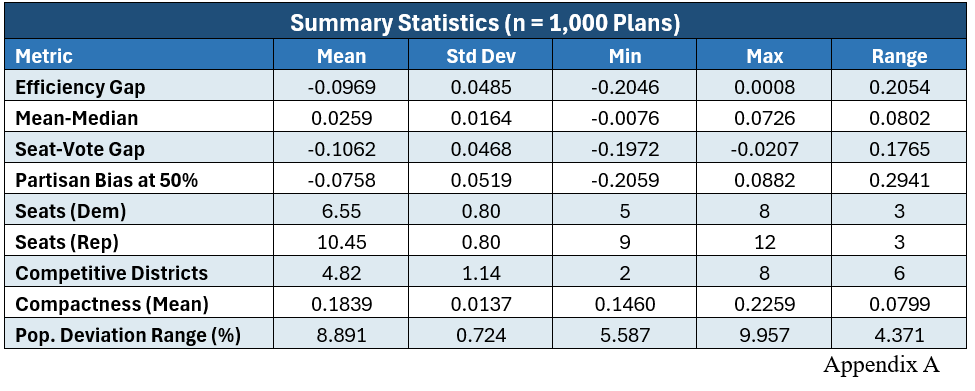
This suggests that Pennsylvania’s political geography creates a Republican advantage under many neutral districting plans. Even though Democrats are competitive statewide, their voters are more geographically concentrated, which can make it harder to turn votes into seats efficiently.
The focused searches added an important wrinkle. When the simulation was allowed to favor Democrats, it did find some 9 Democratic seat maps. So 9D–8R is possible in the model, but it did not appear naturally in the neutral simulation. When the simulation was allowed to favor Republicans, the results could become even more Republican-favorable, in some cases getting down to only 5 Democratic seats.
Overall, the results suggest that Pennsylvania’s seat outcomes are shaped by both voter geography and map design. The regression model shows that voting patterns are strongly connected to socioeconomic and demographic geography. The simulations then show how that geography gets translated into congressional seats. The main finding is not that Democrats can never win 9 seats, but that 9-seat Democratic maps seem harder to produce under neutral map generation, while Republican-favorable outcomes appear more common.
Discussion of Findings
The regression and simulation results work together to tell a larger story. The regression model shows that party vote share is strongly connected to tract-level socioeconomic and demographic characteristics, while the simulation results show that those voting patterns can vary drastically when bounded by a fixed number of districts.
For RQ1, the regression model explained about 79% of the variation in Democratic two-party vote share. This suggests that variables like education, race, ethnicity, income, poverty, occupation, and age are useful predictors of how different areas vote. This does not prove how individual people voted, since the model uses census tracts, but it does show that voting behavior is strongly connected to local geography.
The geographic clustering analysis supports this even more. Neighboring tracts’ average Democratic vote share explained about 86% of a tract’s own Democratic vote share. This shows that voting patterns are highly clustered, which matters because redistricting is basically the process of deciding how those clusters get grouped together.
For RQ2, the neutral simulation showed a clear Republican advantage. Across 1,000 neutral maps, Democrats averaged 6.55 seats out of 17 and never won more than 8 seats. However, the Democratic-focused search did find some 9-seat maps, so 9 Democratic seats are possible in the model. They just did not appear naturally in the neutral simulation.
The fairness metrics also pointed in the same direction. Efficiency gap, seat-vote gap, partisan bias, and mean-median results all suggested that Democratic votes were less efficiently distributed across districts. This fits the idea that Democratic voters are more concentrated geographically, while Republican voters are more spread out.
These results also align with the qualitative case law analysis completed earlier in the course. That analysis found that courts do not generally treat any single quantitative measure as a complete definition of fairness. Instead, courts evaluate redistricting through constitutional principles. The simulation results in this project fit that framework. The metrics point toward a Republican advantage on a structural level, but because boundary drawing is a political endeavor, there is a wide array of outcomes that would be acceptable under US Supreme Court jurisprudence.
There are some limits to the analysis. The vote estimates required assigning VTD results down to Census blocks, which wasn’t always a clean fit. Another limitation of this analysis is that it relies on historical election data, which means it assumes that past voting behavior predicts future voting behavior. More specifically, the model treats votes as votes for a particular party as opposed to votes for individual candidates. Candidate quality, incumbency, campaign spending, national political climate, local issues, turnout differences, and unusual election-year dynamics can all affect actual results. Hyper-tuning district boundaries to maximize political advantage for a state’s caucus necessarily reduces the margins of victory in some districts, which carries with it a risk of political headwinds shifting direction. A 5-point swing can lead to fewer overall seats for a political party. This risk is colloquially known as ‘dummy-mandering’.
Conclusion
This project shows that Pennsylvania’s congressional redistricting outcomes are shaped by both political geography and map design. The regression model found that socioeconomic and demographic characteristics explained a large share of Democratic vote share across census tracts, and the neighbor analysis showed that voting behavior is highly clustered. This supports the idea that election outcomes are not just about statewide vote totals, but also about where voters live.
The simulation results showed that neutral seventeen-district maps tended to favor Republicans, while Democratic-favorable outcomes were possible but less common. This does not prove that one specific map is fair or unfair, but it does show that Pennsylvania’s move from eighteen to seventeen districts creates real sensitivity in how voters are grouped into seats. Overall, the project suggests that redistricting fairness should be evaluated with multiple metrics, simulations, and an understanding of the underlying geography.
Additional research is needed to investigate the predictive value of redistricting over time. Comparing the predicted vote totals by geographic boundary to future elections was the original intent of this project’s work. However, due to scope and time constraints, it was not completed. Comparing predicted vote totals on a census block level to real election outcomes (2022 and 2024 election cycles) would be helpful.
Appendices
Separately uploaded are the following outputs and analysis files:
Appendix A – 1000 neutral maps. This was the output fairness metrics of the initial Cursor work. It uses 100 total randomly generated, and evolves 10 steps per seed.
Appendix B – 1000 x 3 partisan maps. This uses the same 10 seeds for random map generation, and evolves 100 steps per seed in the following 3 categories: dem_search, rep_search, and neutral.
Appendix C – Census regression analysis.
Appendix D – AI-Assisted Qualitative Analysis of Redistricting Case Law.
References
Belotti, P., Buchanan, A., & Ezazipour, S. (2025). Political Districting to Optimize the Polsby-Popper Compactness Score with Application to Voting Rights. Operations Research, 73(5), 2330–2350. (188352115). https://doi.org/10.1287/opre.2024.1078
Bernstein, M., & Walch, O. (2022). Measuring partisan fairness. In M. Duchin & O. Walch (Eds.), Political Geometry (pp. 39–75). Springer International Publishing. https://doi.org/10.1007/978-3-319-69161-9_2
Burden, B., & Smidt, C. (2020). Evaluating Legislative Districts Using Measures of Partisan Bias and Simulations. Sage Open, 10(4), 2158244020981054. https://doi.org/10.1177/2158244020981054
Cantoni, E., & Pons, V. (2022). Does context outweigh individual characteristics in driving voting behavior? Evidence from relocations within the United States. American Economic Review, 112(4), 1226–1272. https://doi.org/10.1257/aer.20201608
Chen, J., & Rodden, J. (2013). Unintentional Gerrymandering: Political Geography and Electoral Bias in Legislatures. Quarterly Journal of Political Science, 8(3), 239–269. https://doi.org/10.1561/100.00012033
DeFord, D., Duchin, M., & Solomon, J. (2020). Recombination: A Family of Markov Chains for Redistricting. Harvard Data Science Review, 3(1). https://doi.org/10.1162/99608f92.eb30390f
Evaluating Legislative Districts Using Measures of Partisan Bias and Simulations. (n.d.). https://doi.org/10.1177/2158244020981054
Fifield, B., Higgins, Michael, Imai, K., & Tarr, A. (2020). Automated Redistricting Simulation Using Markov Chain Monte Carlo. Journal of Computational and Graphical Statistics, 29(4), 715–728. https://doi.org/10.1080/10618600.2020.1739532
Jivetti, B., & Hoque, N. (2020). Population Change and Public Policy. Springer International Publishing AG. http://ebookcentral.proquest.com/lib/pensu/detail.action?docID=6420868
La Raja, R. J., & Wiltse, D. L. (2015). Money That Draws No Interest: Public Financing of Legislative Elections and Candidate Emergence. Election Law Journal, 14(4), 392–410. https://doi.org/10.1089/elj.2015.0306
Mcghee, E. (2014). Measuring Partisan Bias in Single-Member District Electoral Systems. Legislative Studies Quarterly, 39(1), 55–85.
Russell, J., & Lieberman, B. (2023). Gauging Gerrymandering in Pennsylvania: A Monte Carlo Approach Using Methods from Spatial Statistics. Commonwealth, 22(1). https://doi.org/10.15367/com.v22i1.640
Schutzman, Z. (2020). Trade-offs in Fair Redistricting. Proceedings of the AAAI/ACM Conference on AI, Ethics, and Society, AIES ’20, 159–165. https://doi.org/10.1145/3375627.3375802
Skowran, M. (2020). Ways to Evaluate Redistricting Plans. In B. Jivetti & Md. N. Hoque (Eds.), Population Change and Public Policy (pp. 323–343). Springer International Publishing. https://doi.org/10.1007/978-3-030-57069-9_16
Stephanopoulos, N. O., & McGhee, E. M. (2015). Partisan Gerrymandering and the Efficiency Gap. The University of Chicago Law Review, 82(2), 831–900.
Wang, S. S.-H. (2016). Three Tests for Practical Evaluation of Partisan Gerrymandering. Stanford Law Review, 68(6), 1263–1321.
Census Tables
U.S. Census Bureau. (2020a). ACS 5-year estimates data profiles: DP02, selected social characteristics in the United States [Data table]. American Community Survey. https://data.census.gov/table/ACSDP5Y2020.DP02
U.S. Census Bureau. (2020b). ACS 5-year estimates data profiles: DP03, selected economic characteristics [Data table]. American Community Survey. https://data.census.gov/table/ACSDP5Y2020.DP03
U.S. Census Bureau. (2020c). ACS 5-year estimates data profiles: DP05, ACS demographic and housing estimates [Data table]. American Community Survey. https://data.census.gov/table/ACSDP5Y2020.DP05
GitHub Repository for Simulation Analysis (AI Generated Scripts including chat transcripts)
https://github.com/disposable-silacone/PA_Redistricting
Non-APA Resources:
Princeton Gerrymandering Project: https://gerrymander.princeton.edu
University of Chicago Data and Democracy Lab: https://data-democracy.org
MIT Election Data and Science Lab: https://electionlab.mit.edu/data
Census Data: https://data.census.gov
Census Shapefiles: https://tigerweb.geo.census.gov/tigerwebmain/Files/acs25/tigerweb_acs25_tract_pa.html
libpysal: https://pysal.org/libpysal/
GerryChain library: https://gerrychain.readthedocs.io/en/latest/
PA Department of State Election Results: https://www.pa.gov/agencies/dos/resources/voting-and-elections-resources/voting-and-election-statistics/election-data#accordion-9f6b1feab5-item-06362593d1
Appendix A